Audit fixes 1 to 4
Before is the live app (main). After is the fresh branch from today's main, running locally on localhost:8084. Nothing is committed or pushed yet.
1 · One header on every screen (F01, high)
Settings, Profile, Chat, What's new, Privacy and Your answers now use the same cream bar and Fredoka title as the tabs. One change in app/_layout.tsx, reusing the existing headerOptions(theme).
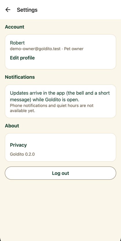
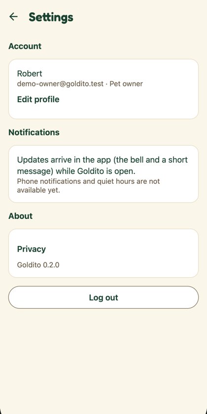
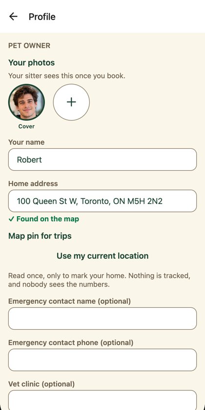
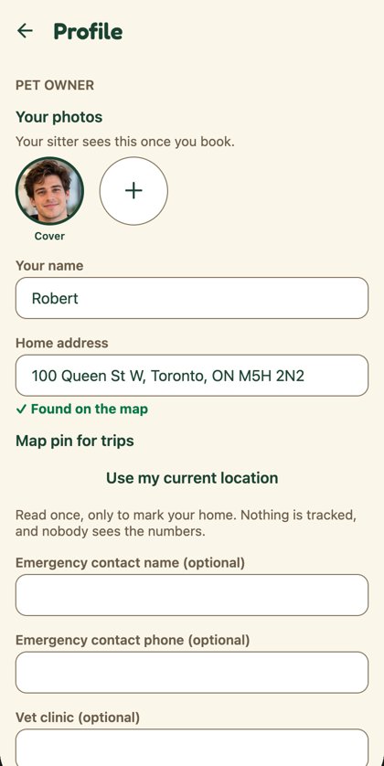
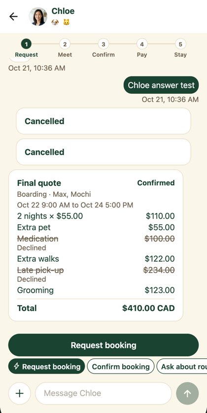
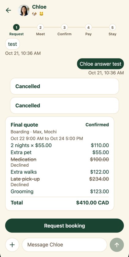
2 · Keyboard focus ring (F51, high)
Press Tab: the browser's thin blue ring becomes a 2 px ring in our primary green with a 2 px gap. Mouse and touch never show it. One CSS rule in public/index.html; the colour follows the theme.
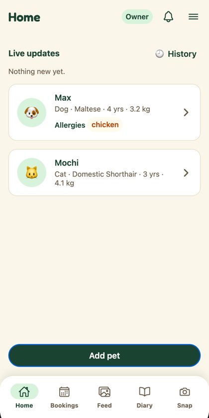
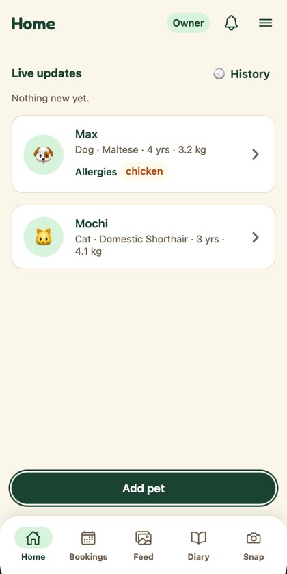
3 · Back button name (F54, high)
No visual change. Screen readers said "index, back" or "(tabs), back"; they now say "Go back" on every stacked screen (checked on Settings, Profile, Chat, Add a pet, pet page).
4 · Placeholder text: your call (F52, high)
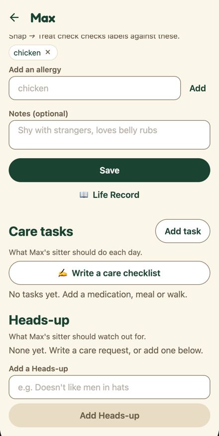
Placeholders were 50% opacity, 2.2:1 on white (WCAG asks 4.5:1). Going full textMuted passes easily but, as the right screen shows, the hints start to look like filled-in answers.
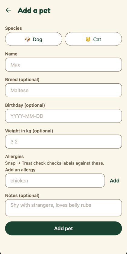
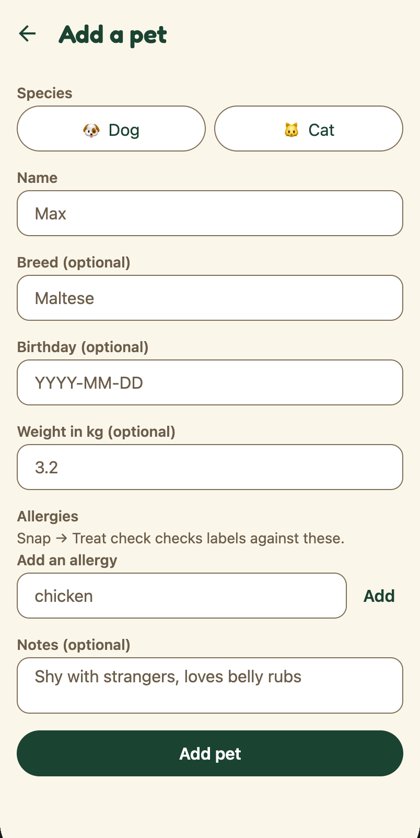
Each card shows an empty field (placeholder) above a filled one (value), so you can judge how distinct they are. The branch currently has B; C would be one new token, placeholder, in the theme.
4b · Placeholder, applied: C + italic
New theme token placeholder (#807160, 4.7:1) and italic hints on web. Typed text stays upright and ink green.
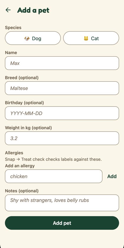
Text fields in action
Try it: click a field, or press Tab to move through it with the keyboard. Empty fields show the italic hint. Pre-filled answers (from the photo guess in onboarding) carry a small Suggested tag that disappears once you change them. The focus ring appears only for the field you're on.
Chips: your call (F21, next batch)
The same job, picking one of a few, has six looks live today:
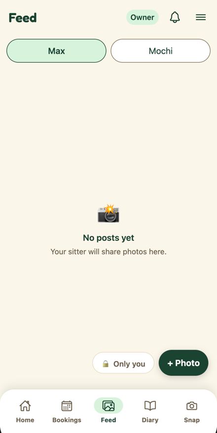
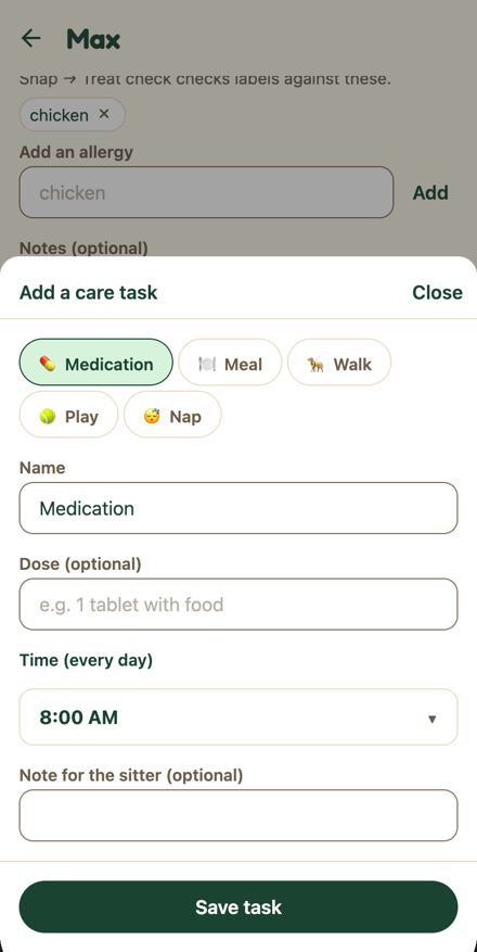
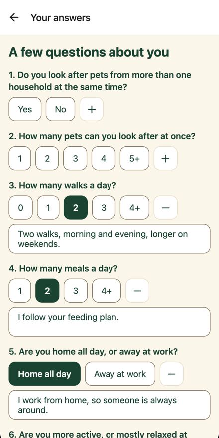
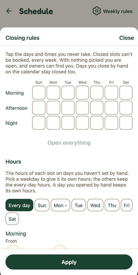
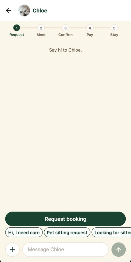
Two ways to make it one chip (40 tall per Figma with a 44 hit area, pill, Bold 13). Click them:
What changed in code
frontend/app/_layout.tsx: the root Stack moved intoRootStack, which spreadsheaderOptions(theme)and sets the focus ring colour.frontend/components/RoleTabs.tsx:headerBackTitle: "Back"+ minimal display mode (names the back button).frontend/public/index.html: one:focus-visiblerule.TextField.tsx,BigInput.tsx,chat/[threadId].tsx: placeholder colour (pending your pick).
Full diff (7 files)
diff --git a/frontend/app/_layout.tsx b/frontend/app/_layout.tsx
index 5158a2e..6fb8da1 100644
--- a/frontend/app/_layout.tsx
+++ b/frontend/app/_layout.tsx
@@ -1,4 +1,6 @@
 import { Stack } from "expo-router";
+import { useEffect } from "react";
+import { Platform } from "react-native";
 import { StatusBar } from "expo-status-bar";

 import { AppShell } from "../components/shell/AppShell";
@@ -7,7 +9,8 @@ import { NotificationsProvider } from "../providers/NotificationsProvider";
 import { SessionProvider } from "../providers/SessionProvider";
 import { TripProvider } from "../providers/TripProvider";
 import { ErrorDialogProvider } from "../providers/ErrorDialogProvider";
-import { ThemeProvider } from "../providers/ThemeProvider";
+import { headerOptions } from "../components/RoleTabs";
+import { ThemeProvider, useTheme } from "../providers/ThemeProvider";
 import { ToastProvider } from "../providers/ToastProvider";

 // Opening /profile directly still has "/" underneath, so Back returns to the app.
@@ -26,16 +29,7 @@ export default function RootLayout() {
                   <MediaPickerProvider>
                     <StatusBar style="dark" />
                     {/* Role areas draw their own headers; only shared screens use this stack header. */}
-                    <Stack screenOptions={{ headerShown: false, headerShadowVisible: false }}>
-                      <Stack.Screen name="profile" options={{ headerShown: true, title: "Profile" }} />
-                      <Stack.Screen name="settings" options={{ headerShown: true, title: "Settings" }} />
-                      <Stack.Screen name="sitter-onboarding" options={{ headerShown: true, title: "Your answers" }} />
-                      <Stack.Screen name="whats-new" options={{ headerShown: true, title: "What's new" }} />
-                      <Stack.Screen name="chat/[threadId]" options={{ headerShown: true, title: "Chat" }} />
-                      <Stack.Screen name="privacy" options={{ headerShown: true, title: "Privacy" }} />
-                      <Stack.Screen name="dev/gestures" options={{ headerShown: true, title: "Gesture lab" }} />
-                      <Stack.Screen name="dev/health" options={{ headerShown: true, title: "API health" }} />
-                    </Stack>
+                    <RootStack />
                   </MediaPickerProvider>
                 </TripProvider>
               </NotificationsProvider>
@@ -46,3 +40,32 @@ export default function RootLayout() {
     </AppShell>
   );
 }
+
+/** Shared screens (profile, settings, chat, ...) get the same header as the role stacks. */
+function RootStack() {
+  const theme = useTheme();
+
+  // Keyboard focus ring colour for public/index.html's :focus-visible rule.
+  useEffect(() => {
+    if (Platform.OS === "web") document.documentElement.style.setProperty("--focus-ring", theme.color.primary);
+  }, [theme.color.primary]);
+
+  return (
+    <Stack
+      screenOptions={{
+        ...headerOptions(theme),
+        headerShown: false,
+        contentStyle: { backgroundColor: theme.color.background },
+      }}
+    >
+      <Stack.Screen name="profile" options={{ headerShown: true, title: "Profile" }} />
+      <Stack.Screen name="settings" options={{ headerShown: true, title: "Settings" }} />
+      <Stack.Screen name="sitter-onboarding" options={{ headerShown: true, title: "Your answers" }} />
+      <Stack.Screen name="whats-new" options={{ headerShown: true, title: "What's new" }} />
+      <Stack.Screen name="chat/[threadId]" options={{ headerShown: true, title: "Chat" }} />
+      <Stack.Screen name="privacy" options={{ headerShown: true, title: "Privacy" }} />
+      <Stack.Screen name="dev/gestures" options={{ headerShown: true, title: "Gesture lab" }} />
+      <Stack.Screen name="dev/health" options={{ headerShown: true, title: "API health" }} />
+    </Stack>
+  );
+}
diff --git a/frontend/app/chat/[threadId].tsx b/frontend/app/chat/[threadId].tsx
index 6e13f5b..7d0a6d3 100644
--- a/frontend/app/chat/[threadId].tsx
+++ b/frontend/app/chat/[threadId].tsx
@@ -645,7 +645,7 @@ export default function Chat() {
           value={text}
           onChangeText={setText}
           placeholder={`Message ${header.otherName}`}
-          placeholderTextColor={`${theme.color.textMuted}80`}
+          placeholderTextColor={theme.color.placeholder}
           maxLength={2000}
           multiline
           numberOfLines={1}
diff --git a/frontend/components/RoleTabs.tsx b/frontend/components/RoleTabs.tsx
index a2aa58d..e8903d9 100644
--- a/frontend/components/RoleTabs.tsx
+++ b/frontend/components/RoleTabs.tsx
@@ -82,6 +82,9 @@ export function headerOptions(theme: Theme) {
     headerShadowVisible: false,
     headerStyle: { backgroundColor: theme.ui.chrome },
     headerTintColor: theme.color.primary,
+    // Screen readers say "Go back", not the route segment ("(tabs), back"); minimal mode keeps the label hidden.
+    headerBackTitle: "Back",
+    headerBackButtonDisplayMode: "minimal" as const,
     headerTitleStyle: {
       color: theme.color.text,
       fontSize: display ? theme.fontSize.title : theme.fontSize.body,
diff --git a/frontend/components/ownerOnboarding/BigInput.tsx b/frontend/components/ownerOnboarding/BigInput.tsx
index 306c0ef..b034cad 100644
--- a/frontend/components/ownerOnboarding/BigInput.tsx
+++ b/frontend/components/ownerOnboarding/BigInput.tsx
@@ -9,7 +9,7 @@ export function BigInput(props: Omit<TextInputProps, "style">) {
   const styles = useThemedStyles(makeStyles);
   return (
     <TextInput
-      placeholderTextColor={`${theme.color.textMuted}80`}
+      placeholderTextColor={theme.color.placeholder}
       style={[styles.input, props.multiline && styles.multiline]}
       {...props}
     />
diff --git a/frontend/components/ui/TextField.tsx b/frontend/components/ui/TextField.tsx
index 8d5cdf1..0945cb4 100644
--- a/frontend/components/ui/TextField.tsx
+++ b/frontend/components/ui/TextField.tsx
@@ -20,7 +20,7 @@ export function TextField({ label, error, onFocus, onBlur, ...inputProps }: Prop
       <TextInput
         accessibilityLabel={label}
         // A hint, not a value: lighter than typed text.
-        placeholderTextColor={`${theme.color.textMuted}80`}
+        placeholderTextColor={theme.color.placeholder}
         onFocus={(e) => {
           setFocused(true);
           onFocus?.(e);
diff --git a/frontend/public/index.html b/frontend/public/index.html
index f60f8e1..78dd5f1 100644
--- a/frontend/public/index.html
+++ b/frontend/public/index.html
@@ -24,6 +24,21 @@
         flex: 1;
       }
     </style>
+    <style id="focus-ring">
+      /* One keyboard focus ring (DESIGN.md): 2 px primary, 2 px offset. The app sets --focus-ring from the theme. */
+      :focus-visible {
+        outline: 2px solid var(--focus-ring, #1b4332) !important;
+        outline-offset: 2px;
+      }
+      :focus:not(:focus-visible) {
+        outline: none;
+      }
+      /* Hints read as hints, never as typed answers. */
+      input::placeholder,
+      textarea::placeholder {
+        font-style: italic;
+      }
+    </style>
   </head>
   <body>
     <noscript>Goldito needs JavaScript to run.</noscript>
diff --git a/frontend/theme/themes.ts b/frontend/theme/themes.ts
index 8a66f09..6301ff4 100644
--- a/frontend/theme/themes.ts
+++ b/frontend/theme/themes.ts
@@ -18,6 +18,8 @@ export type SkinColors = {
   track: string;
   text: string;
   textMuted: string;
+  /** Input hints: lighter than textMuted so they never read as typed values, still 4.5:1 on white. */
+  placeholder: string;
 };

 /** Theme presets = the modes of the Figma Color collection. Coat-color skins (6–8, from the designer) are added here in 11.10. */
@@ -33,6 +35,7 @@ export const themes = {
     track: tokens.color.track,
     text: tokens.color.text,
     textMuted: tokens.color.textMuted,
+    placeholder: tokens.color.textMuted,
   },
   /** Warmer neutrals, same green (Figma mode `Balanced`). */
   balanced: {
@@ -46,6 +49,7 @@ export const themes = {
     track: "#E6E1D9",
     text: "#1F1B16",
     textMuted: "#5E5850",
+    placeholder: "#7A746B",
   },
   /** The app's look (Mook's Expressive): ink on cream, mint accent, warm tan lines. `default` is the earlier look. */
   expressive: {
@@ -61,6 +65,8 @@ export const themes = {
     text: "#1B4332",
     // 5.9:1 on cream.
     textMuted: "#6B5D4A",
+    // 4.7:1 on white.
+    placeholder: "#807160",
   },
 } satisfies Record<string, SkinColors>;