Case study · Experimentation · Aplos (now Velora) · Raisely · 2 min read
Fee Opt-In: Winning the Moment Donors Change Their Mind
An A/B test on the moment a donor edits their fee. The winning design took opt-in from 75% to 92%.
- Role
- Senior Product Designer
- Company
- Aplos (now Velora) · Raisely2026
- Team
- With PM, Engineering, and data partners
- Tools
- Figma, Cursor, MagicPatterns, A/B Testing, Pendo
- Problem
- A redesigned fee box looked like a win, 75% to 82%, but hid a leak in the fallback flow donors landed in.
- Decision
- I argued to pause the rollout, redesigned the moment a donor edits their fee, and tested four variations in Pendo to find the highest-return option.
- Outcome
- Fee opt-in reached 92%, with conversion and average gift size held steady.
- Principle
- Design the decision, not the default.
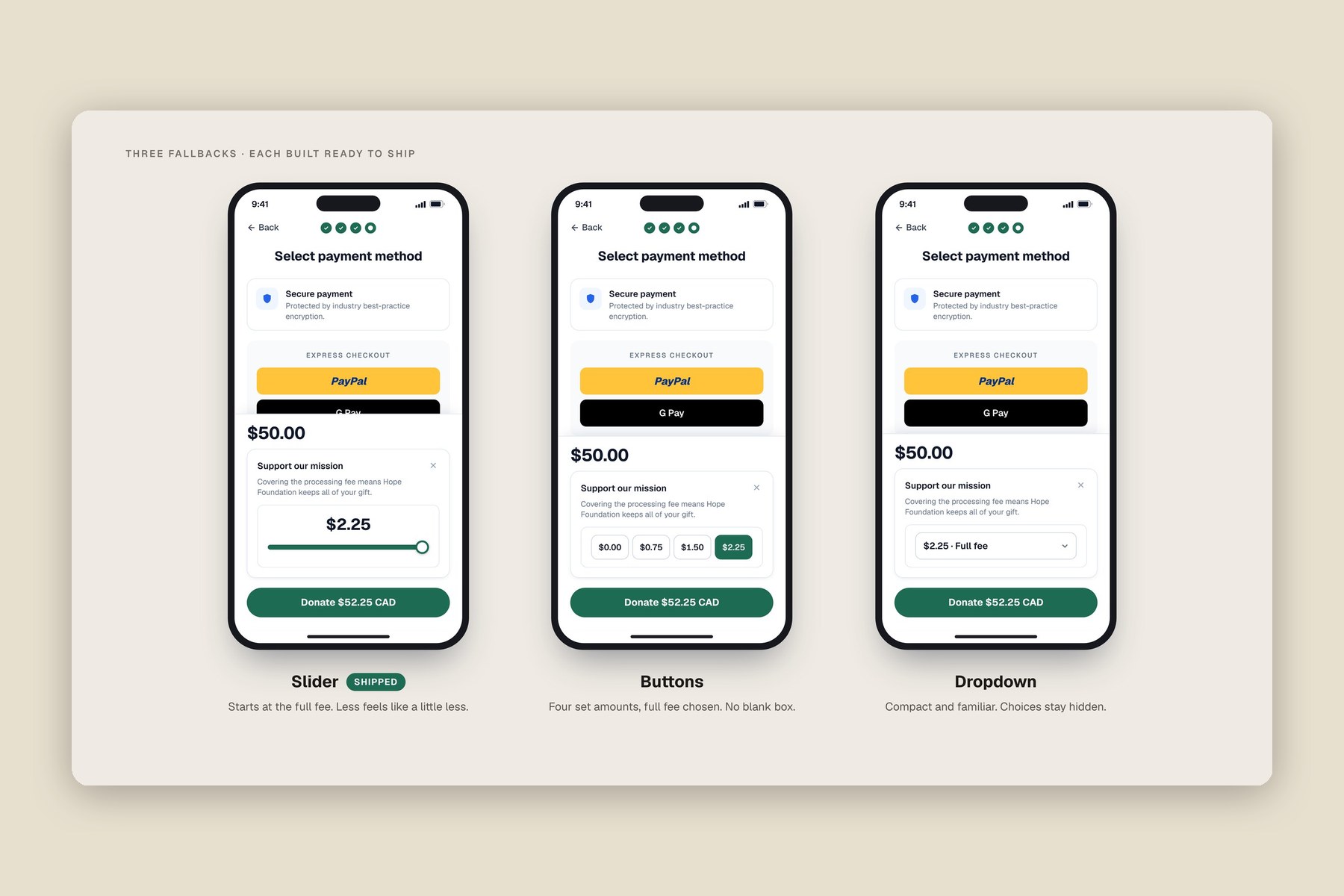
The screens on this page are white-labelled recreations for a fictional charity. The real product is confidential.
The Deceptive Win
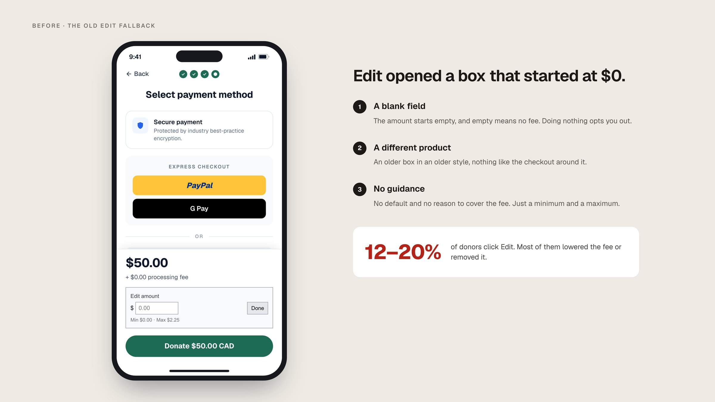
A redesigned fee box on Raisely had just lifted opt-in from 75% to 82%, near the 90% benchmark. But the 12–20% of donors who clicked "Edit" mostly dragged the fee to the minimum or opted out. Awareness wasn't the problem. The opportunity was decision design: the few seconds after a donor decides to change something.
Reframing the Problem
The easy move was to ship the 82%. I argued to pause: the edit box dropped donors into an older fallback that nudged them toward the smallest contribution. The new question: how do we make the easiest path a fair one, without it ever feeling coercive? Donor trust is the product.
Designing the Decision, Not the Default
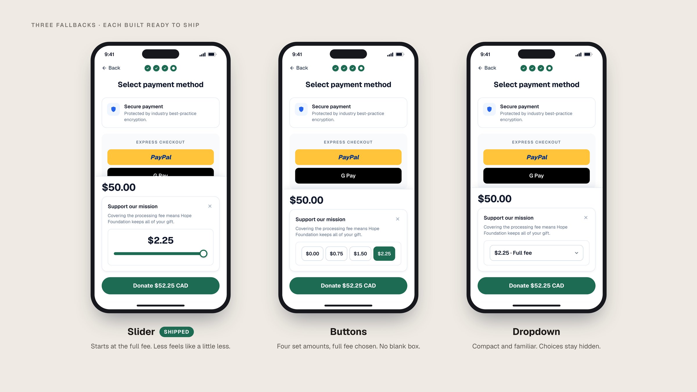
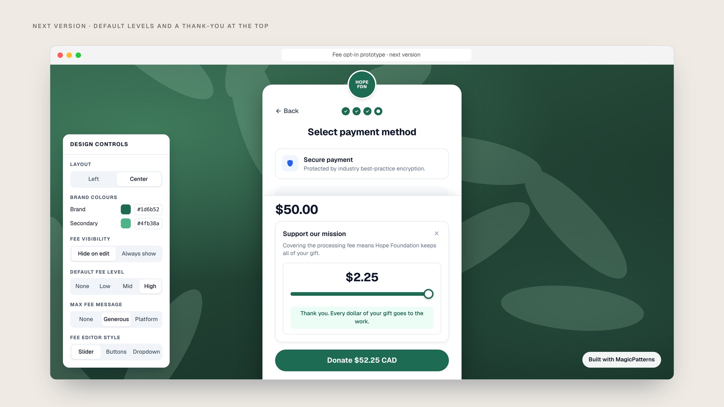
I designed three variants grounded in defaults, anchoring and soft-decline (a slider, toggle buttons and a segmented dropdown) and tested them against the existing control in Pendo. Each was built production-ready, so the winner could ship platform-wide the day the test closed.
| Legacy fallback | Redesigned fallback | |
|---|---|---|
| 1 | Fragmented. The new edit box dropped donors into an older UI that looked and behaved differently. | One consistent control, built production-ready so the winner could ship platform-wide. |
| 2 | A slide to the smallest amount. The fallback quietly nudged donors toward the minimum. | Anchored at a sensible default. "A little less" feels like a small step, not a cliff to zero. |
| 3 | A blank-slate field. Donors had to invent an amount. | Pre-framed choices in the toggle and dropdown variants, with a soft decline kept in reach. |
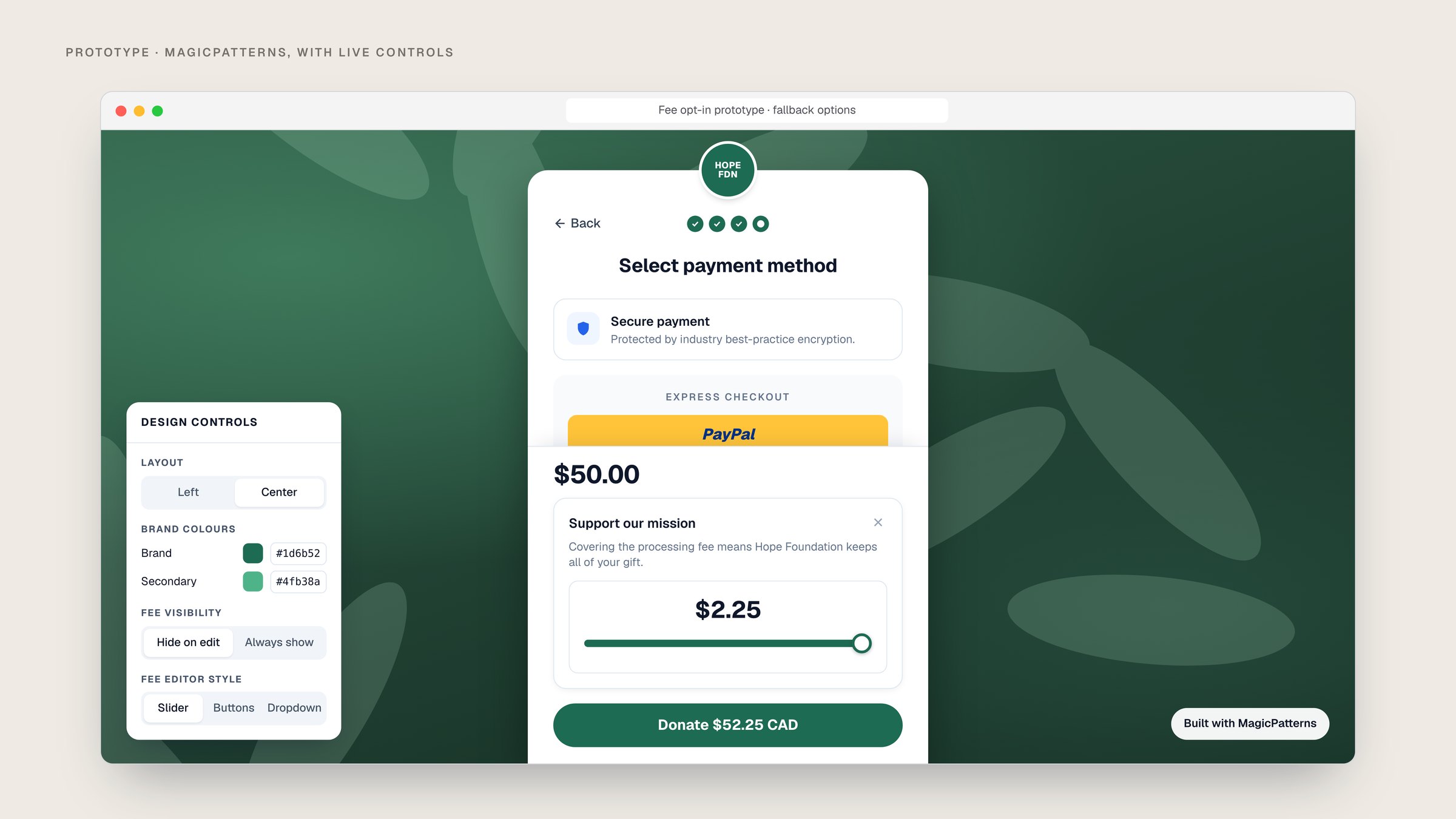
Try itA white-labelled rebuild of the checkout, after my MagicPatterns prototype. Pick a fallback, click Edit on the fee, and compare what you chose with what donors did.
Prototyping With AI
Instead of static mocks, I built interactive prototypes in Cursor and MagicPatterns where PMs and engineers could change thresholds, defaults and fallback logic and watch the outcome. It cut alignment time and surfaced constraints before high-fidelity design. You can still try the version 1 prototype and the future-state concept.
The Hypothesis
Introducing a modernized fallback control when a donor clicks "Edit" will increase the average fee opt-in value while maintaining or improving the existing conversion rate.
What Happened
The Slider lifted fee opt-in from 75% to 92%, past the 90% benchmark, while conversion and average gift size held steady. It shipped as the fallback across the platform.
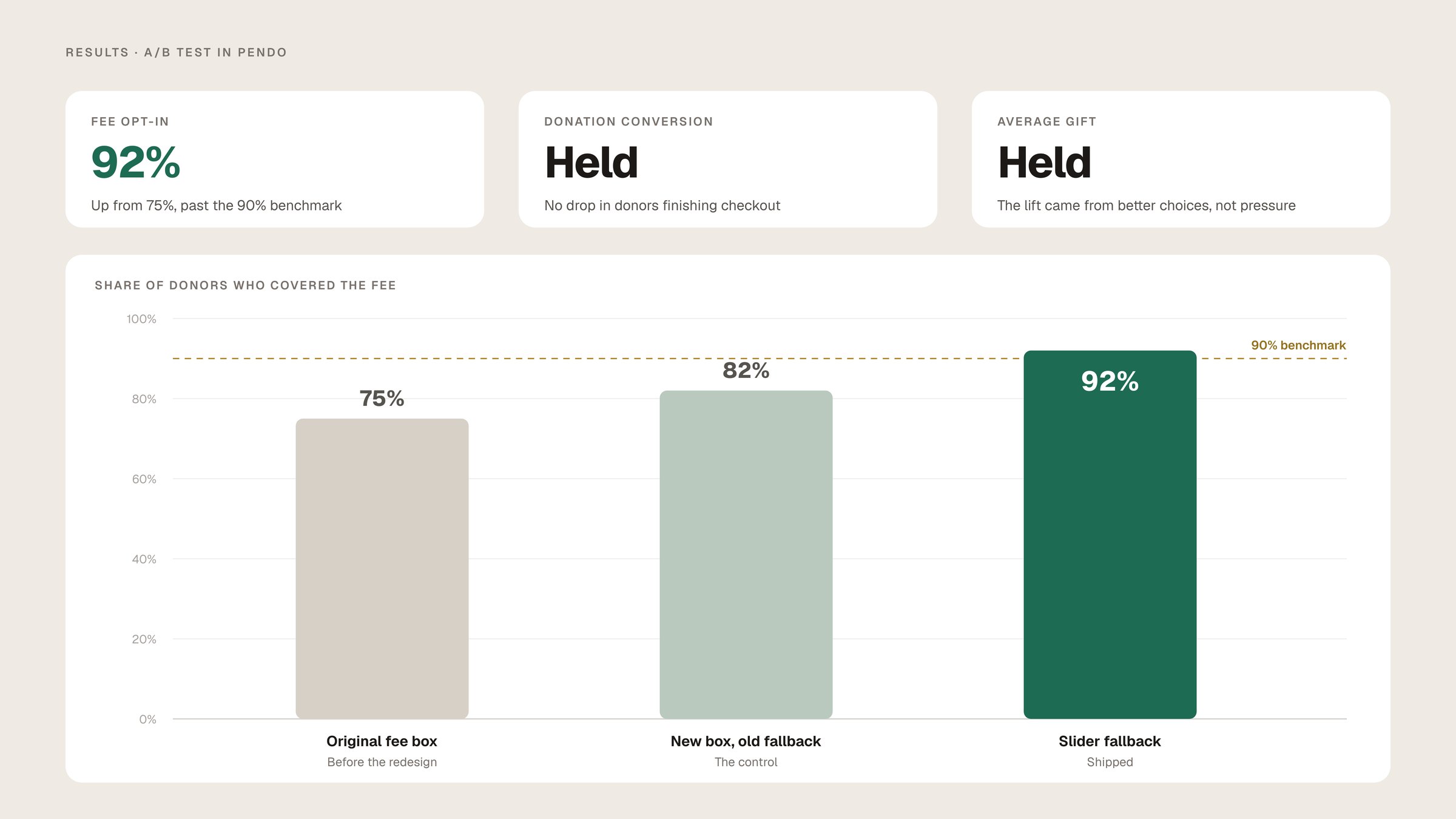
Improving how a user changes their decision can be just as effective as improving the default itself.
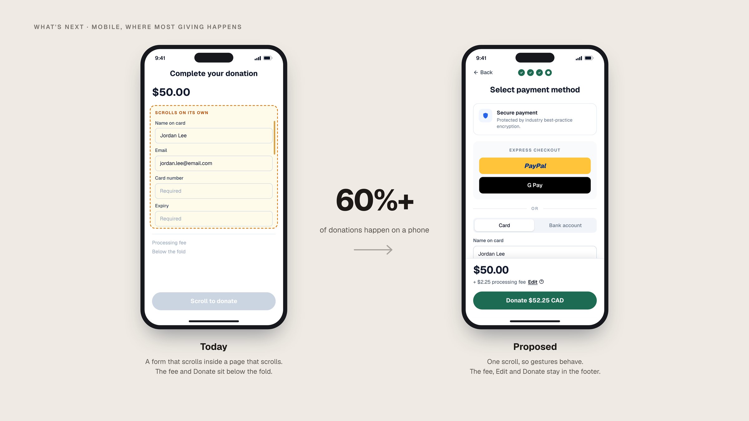
Mobile, Where 60% of Giving Happens
Next is mobile, where 60%+ of donations happen and nested scrolling hides the fee-and-total review.

Thanks for reading.