Case study · Design System · Keela, then Aplos · 2 min read
Orchid: A Design System Born From a Merger
Three products, 340+ components, and three teams who didn't choose each other. One shared system.
- Role
- Lead, then Senior Product Designer
- Company
- Keela, then Aplos2024 to 2026
- Team
- 3 designers, 2 front-end engineers
- Tools
- Figma, Storybook, GitHub, Chromatic
- Problem
- Three merged products, 340+ scattered components, and three teams who did not choose to work together.
- Decision
- I treated it as an adoption problem: earned dedicated engineering time with cross-department survey data, then replaced heavy governance with 48-hour async reviews.
- Outcome
- One shared library, adopted across all three products.
- Principle
- Governance should reduce friction, not create it.
The Situation
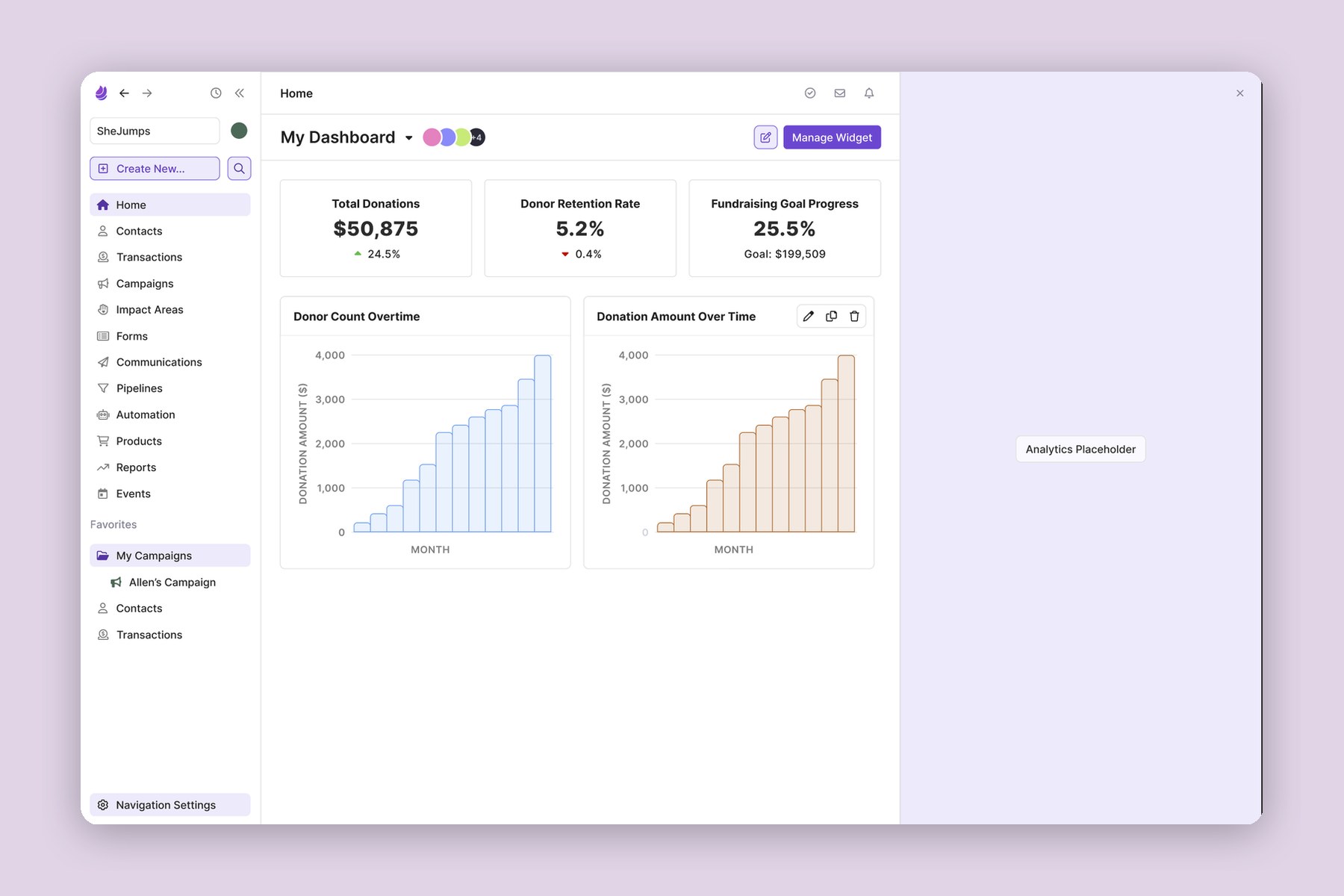
After the acquisition in 2025, three products with three visual languages had to become one. I saw early that this wasn't a design system problem. It was a culture problem: three teams with different histories had to choose to build on shared foundations.
Making the Case
Orchid started at Keela in 2024. Earlier design system efforts had died without engineering time, so before pitching, I surveyed five departments, letting leadership see the problem in their own teams' words.
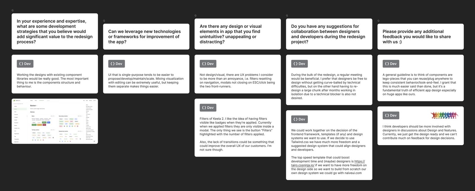
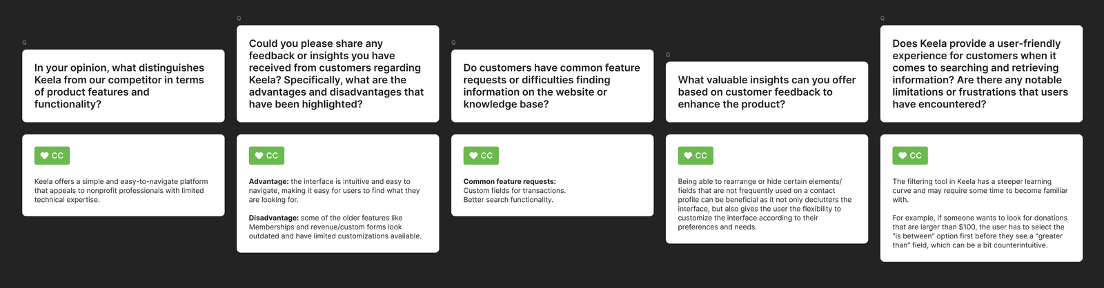
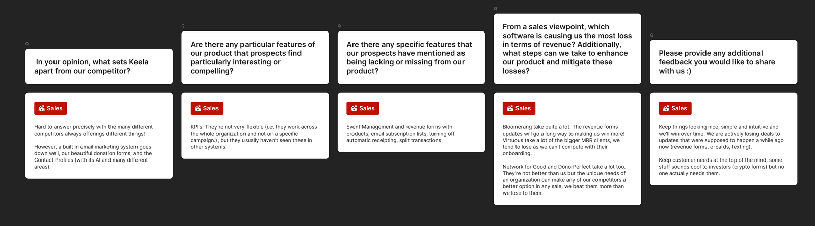
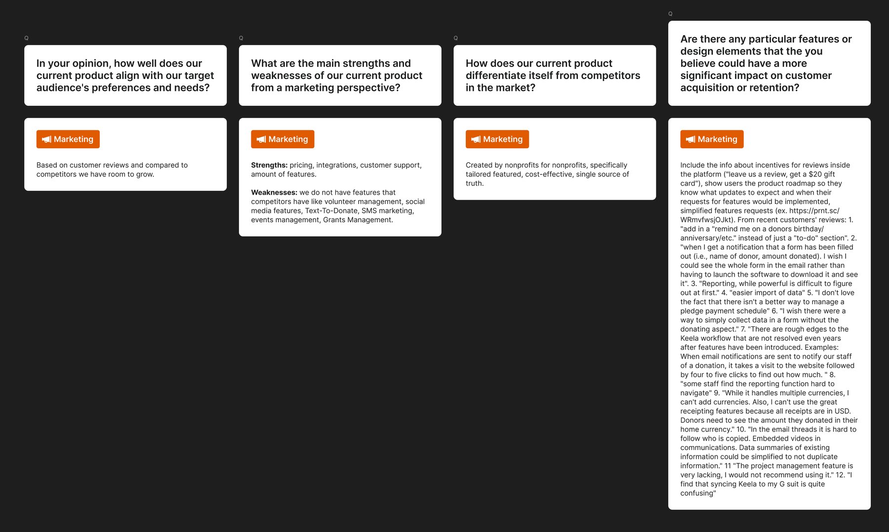

It worked: we got two dedicated frontend engineers, the first time a design system had earned that.
How We Built It
An inventory found 340+ unique components across the three products. Workshops with each team, not presentations to them, distilled them into a small set of shared primitives built on tokens, with Storybook as the source of truth and Chromatic catching regressions on every pull request.
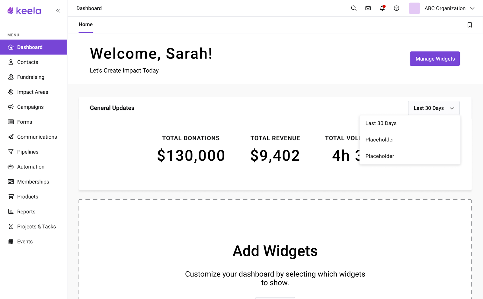
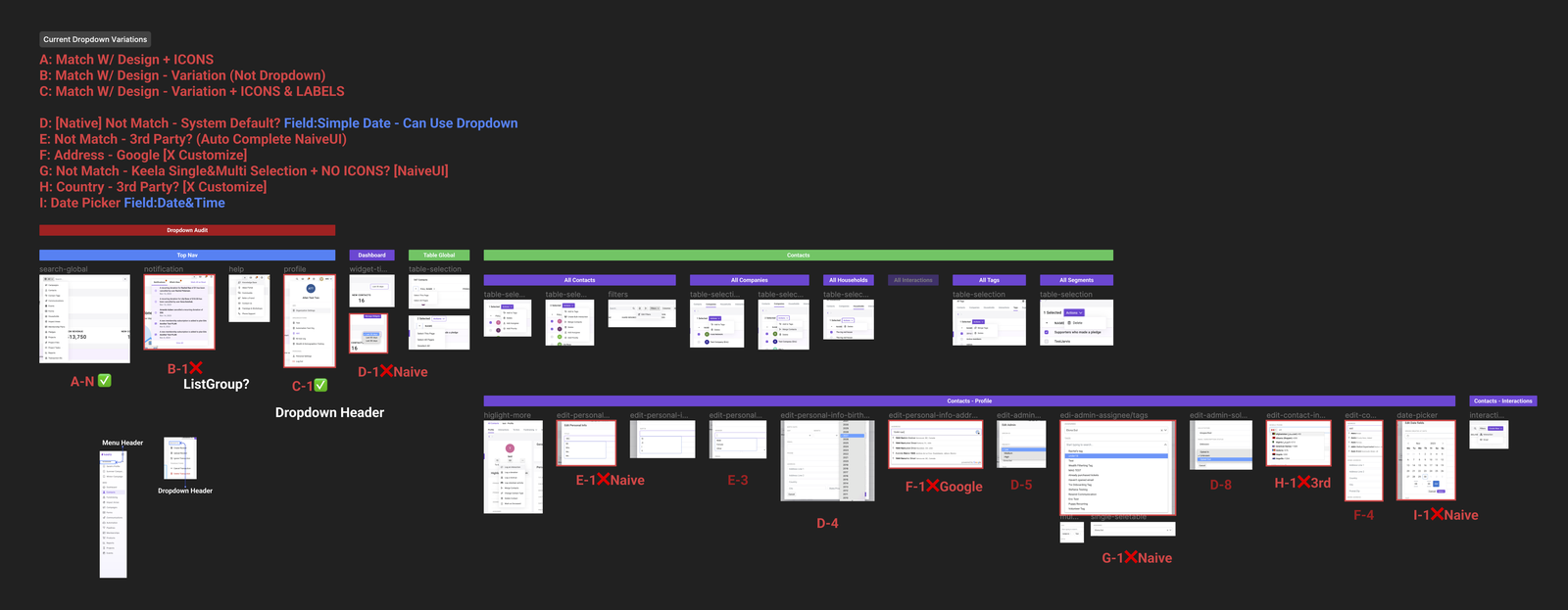
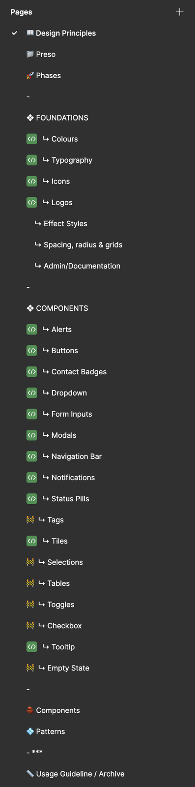
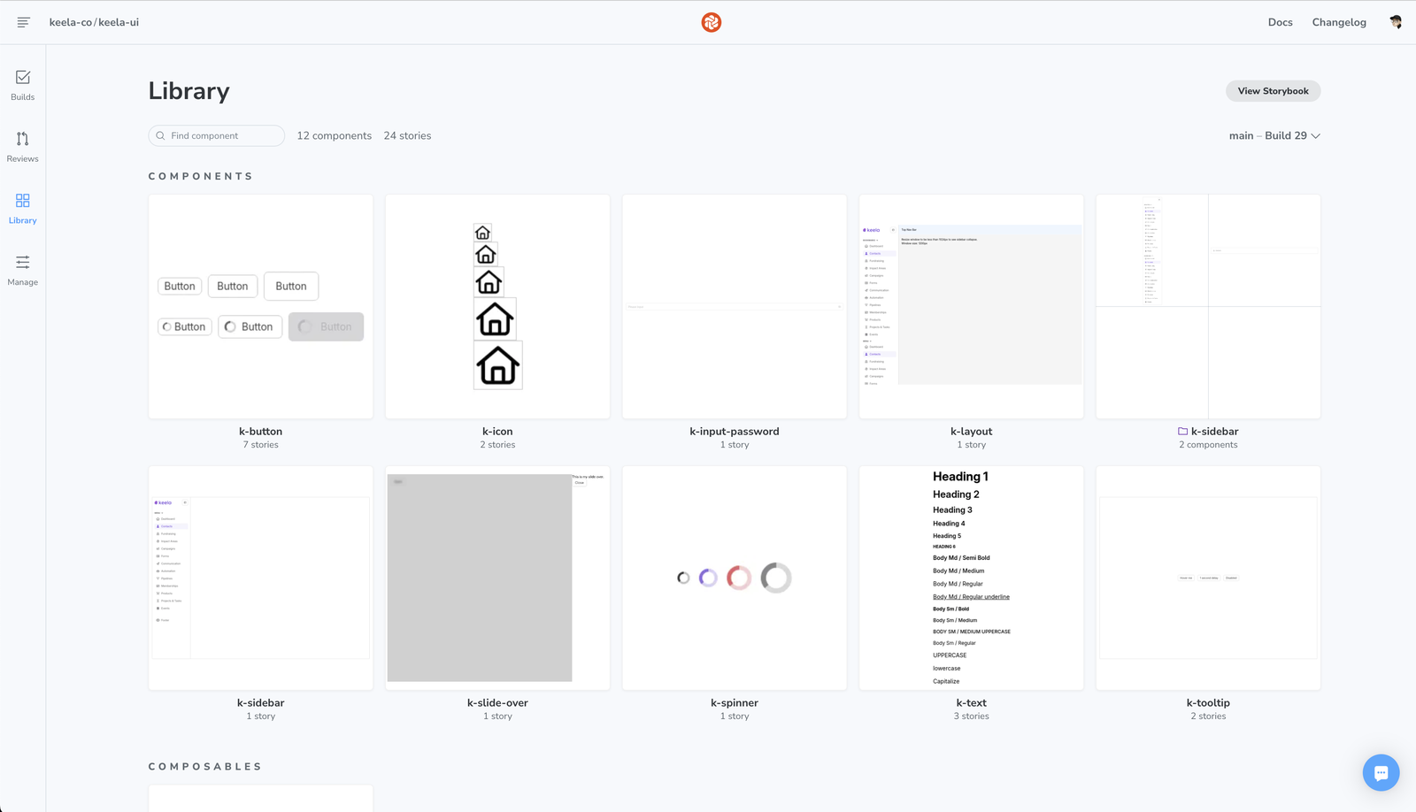
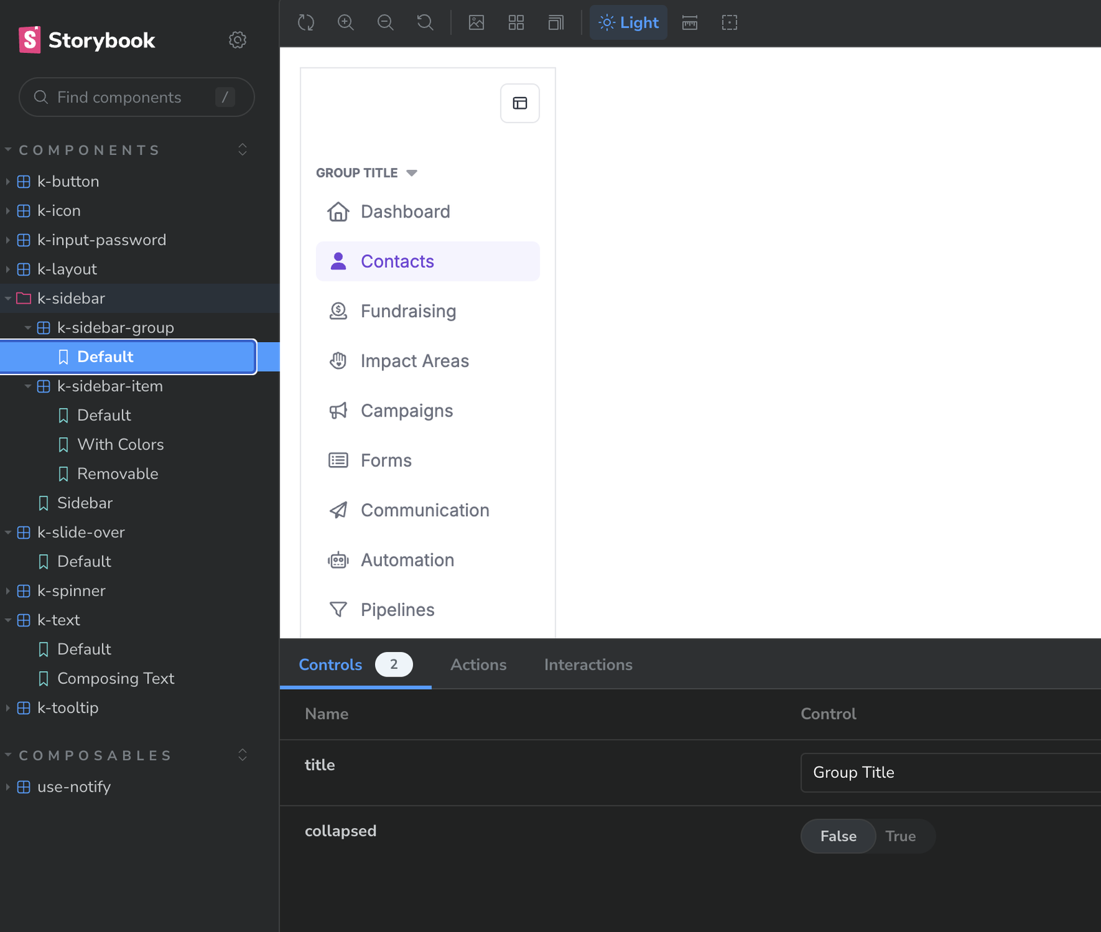
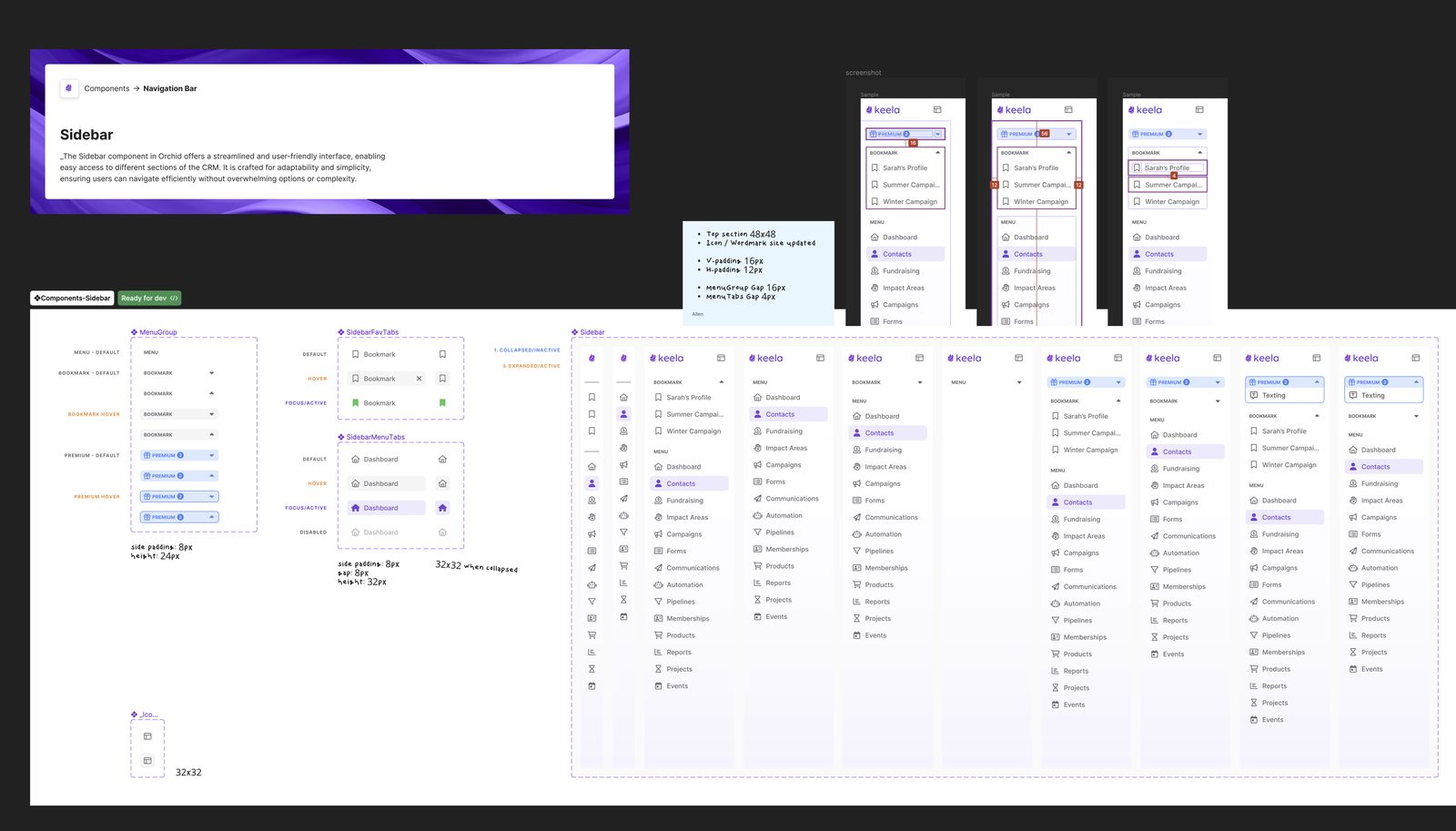
I first built tight governance, and contribution proposals dropped to near zero. The formality was the problem, so I rebuilt around 48-hour async reviews and light templates. Proposals doubled.
| Before Orchid | With Orchid | |
|---|---|---|
| 1 | 340+ unique components across three products, each with its own colors, spacing and patterns. | One shared set of primitives, distilled in workshops with each team. |
| 2 | Values set by hand, down to decimal measurements that never matched between design and code. | Tokens first. Color, spacing, type, elevation and motion flow from Figma variables to code. |
| 3 | Inconsistencies found after release, often by customers. | Caught on every pull request by Chromatic visual regression tests. |
| 4 | Formal governance, and contribution proposals that dropped to near zero. | 48-hour async reviews with lightweight templates. Proposals doubled. |
What Happened
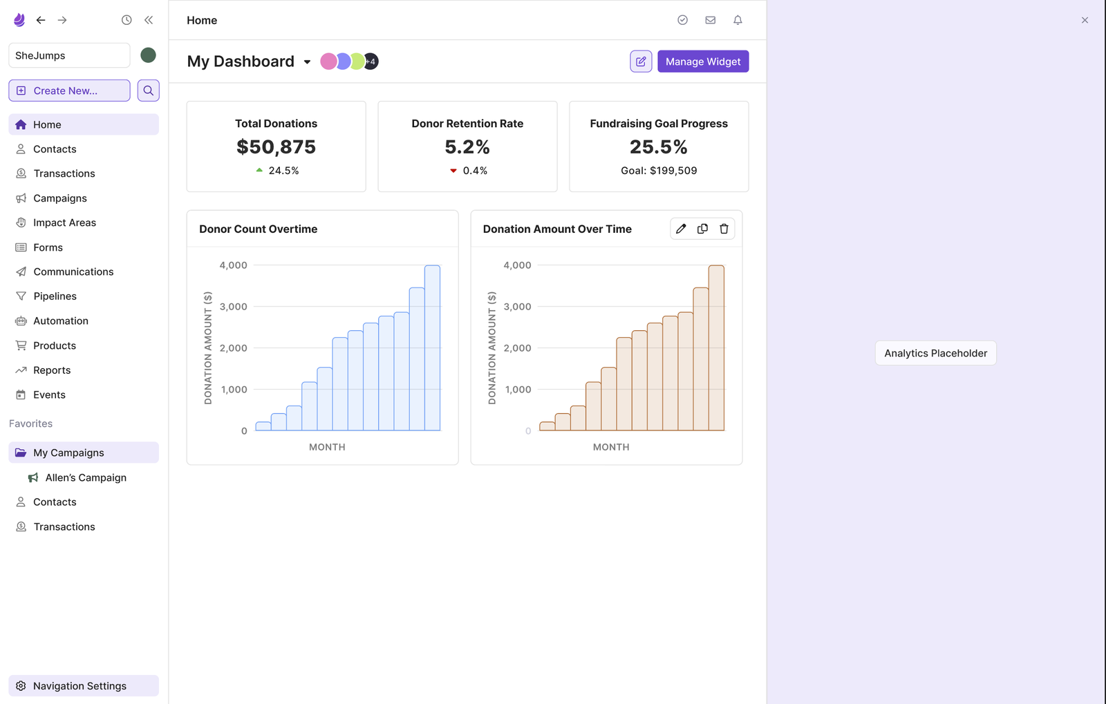
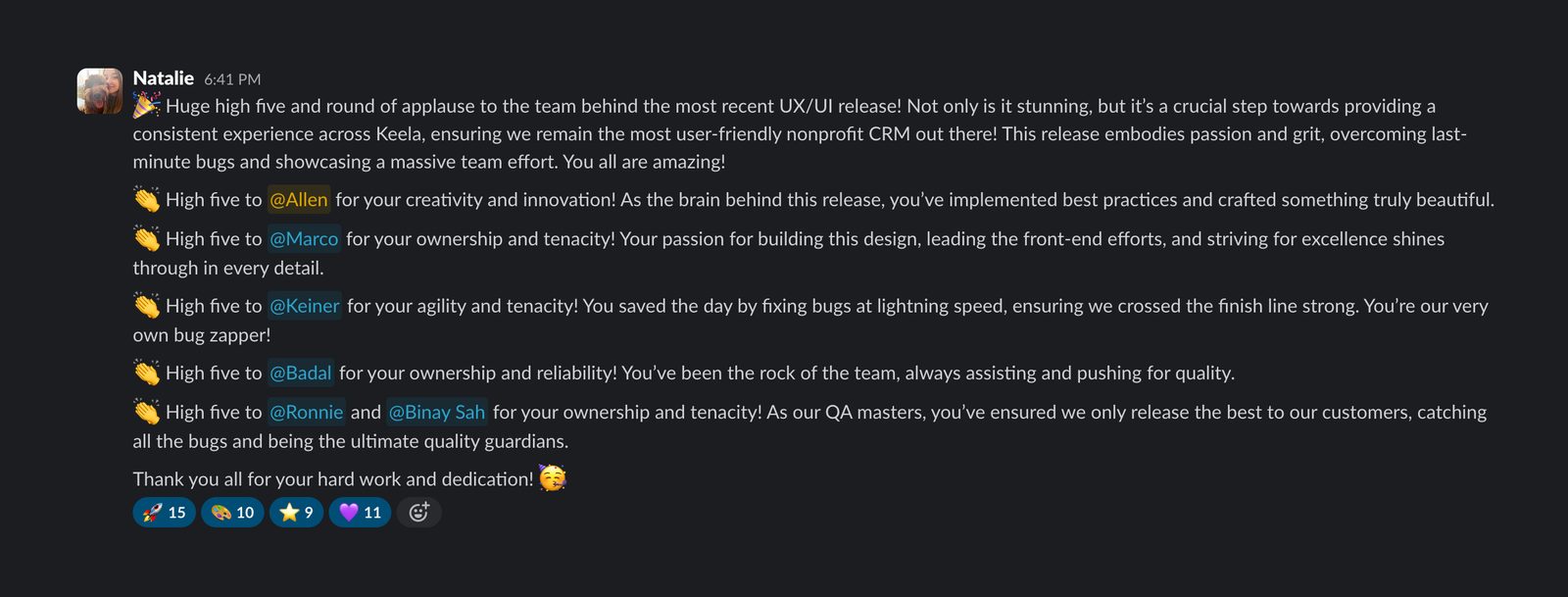
Orchid was adopted across all three products and is now the foundation of the unified experience. Along the way it earned two dedicated front-end engineers, and contribution proposals doubled once reviews went async.
A design system nobody contributes to is a style guide with extra steps.

Thanks for reading.
Built with
- Natalie, Lead PM
- Marco, Lead Developer
- Keiner, Senior Developer
- Badal, Lead QA
- Ronnie, QA Engineer
- Binay, QA Engineer